Designing Da South: Brand Identity for Hip-hop

Designing is one of my favourite things to do! I believe that when you're truly passionate about something you do, it'll definitely show in the results. I wanna share with you one of my ongoing projects - designing a brand identity for a hip-hop blog known as Da South. Let's go!
My Design Process
Professional designers usually follow a design process to tackle their design projects, and I am no exception. However, I don't mind switching things up if need be. My typical design process, though, follows these three simple steps:
1. Research and Inspiration
First things first, I gotta feel inspired to design a really good piece. See, I'm not a corporate nerd who sits behind his computer designing projects all day for clients because it's his job. This is art to me, the feeling of inspiration before I dive into a project is super important. When I lack the inspiration, doing a background check on the client and their niche usually does the trick.
The hip-hop scene is all I need for inspiration for Da South's project. It's so vibrant and full of energy. The graffiti, the music, the swag - the whole culture inspires my designs for Da South.

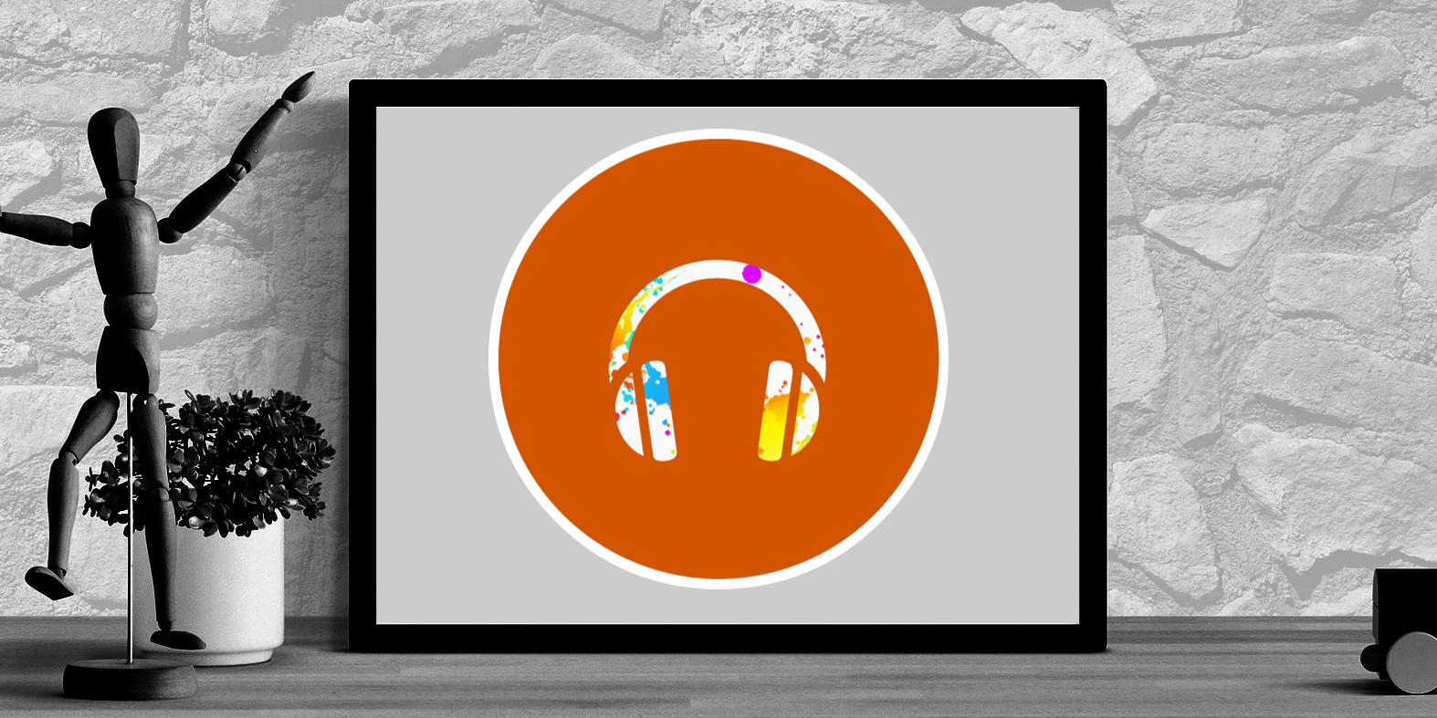
Check out the logo for example. The bright orange background screams "look at me" and the white headphones icon encased in a circle tells you that Da South is all about their music.
The hip-hop scene's vibrant energy and culture have been a constant source of inspiration for me as I work on Da South's brand identity. With this foundation, I'm always ready to move on to the next step in the design process.
2. Design Decisions
I'm ready to start making some strokes on my canvas when the inspiration is there. But before I do that, I have to make some important decisions. These are decisions that can either make or break a project. Working with the client, I have to carefully pick the palette, typography, and iconography that'll go well with the project as well as the client's brand message.

Prior to the orange brand identity, Da South had a dark theme and somewhat gloomy vibes (which was pretty cool for that era, by the way). I want to put more life into Da South and orange does the trick. It allows for a more playful and inviting feel. Now the attention grabbing colour, representing hip-hop's vibrant lifestyle, is prevalent in Da South's brand identity.
The white headphones, with a splash of colour, icon clearly communicates Da South's focus on music. Naturally as a minimalist, I like the simplicity of this icon because it allows for so much versatility. It looks good in large displays as well as it looks good in tiny displays. You don't have to zoom in when it's used as a tag in a video, or a profile photo on Instagram.
With a carefully chosen colour palette, typography, and iconography, Da South's brand identity now embodies the vibrant energy of the hip-hop scene. These design decisions help create a unique and recognizable visual identity that effectively communicates the brand's message.
3. Iteration and Refining
The last step in my design process is like a beta testing phase. It requires clear and constant communication with the client. I don't want to get lost in creativity and totally neglect their needs. With the clients feedback, I iterate and refine my designs to make sure that the client is happy with the outcome.

Sometimes a design looks good in theory, but not when implemented. Like a Facebook banner or cover for an example. I could design it really good only to have it looking blurry and distorted when uploaded. This usually prompts for quick reiterating and refining.
In addition to practical considerations, I also take client's feedback into account. It's important that their needs are met in the end.
Through iteration and refining, I ensure that my designs meet the client's needs and expectations. By maintaining open communication and incorporating feedback, I can deliver a final product that effectively represents the brand's identity and message.
Finally
By following my three-step design process, I'm able to create unique and effective brand identities that capture the essence of my clients' visions. The Da South project is a great example of how research, thoughtful design decisions, and iteration can come together to create a vibrant and recognizable brand.
Now you know my design process. Time to take your business to the next level? Let's create a brand identity that's fire!

